print("Hello world!")[1] "Hello world!"print("Hello world!")[1] "Hello world!"print("Hello from Python!")Hello from Python!foo = 1 + 1
print(foo)2Write a python function that takes two arguments, a list and a integer and returns the number of times that integer comes up in the list.
import numpy as np

v = np.array([1,2,3,4,5])
print(np.mean(v))3.0rng = np.random.default_rng()
v2 = rng.integers(low=0,high=10,size=5)
print(v*v2)[ 4 14 24 32 30]Using the functions/methods np.arange, reshape produce a 3x5 array where each integer between 0 and -14 are represented exactly once.
import scipy
from scipy.stats import describe
describe(v)
DescribeResult(nobs=5, minmax=(1, 5), mean=3.0, variance=2.5, skewness=0.0, kurtosis=-1.3)import matplotlib.pyplot as plt
plt.style.use('_mpl-gallery')
# make the data
np.random.seed(3)
x = 4 + np.random.normal(0, 2, 24)
y = 4 + np.random.normal(0, 2, len(x))
# size and color:
sizes = np.random.uniform(15, 80, len(x))
colors = np.random.uniform(15, 80, len(x))
# plot
fig, ax = plt.subplots()
ax.scatter(x, y, s=sizes, c=colors, vmin=0, vmax=100)
ax.set(xlim=(0, 8), xticks=np.arange(1, 8),
ylim=(0, 8), yticks=np.arange(1, 8))[(0.0, 8.0), [<matplotlib.axis.XTick object at 0x0000017DBB75C8D0>, <matplotlib.axis.XTick object at 0x0000017DBB753290>, <matplotlib.axis.XTick object at 0x0000017DBB750A10>, <matplotlib.axis.XTick object at 0x0000017DBB738D50>, <matplotlib.axis.XTick object at 0x0000017DBB79B2D0>, <matplotlib.axis.XTick object at 0x0000017DBB795750>, <matplotlib.axis.XTick object at 0x0000017DBB7966D0>], (0.0, 8.0), [<matplotlib.axis.YTick object at 0x0000017DBB76C8D0>, <matplotlib.axis.YTick object at 0x0000017DBB64E290>, <matplotlib.axis.YTick object at 0x0000017DBB78AD50>, <matplotlib.axis.YTick object at 0x0000017DBB7A2D90>, <matplotlib.axis.YTick object at 0x0000017DBB7AD0D0>, <matplotlib.axis.YTick object at 0x0000017DBB7AEE50>, <matplotlib.axis.YTick object at 0x0000017DBB7AFC10>]]plt.show()
Using np.arange and rng.integers, draw a bargraph that graphs 8 integers between 0 an 10.
np.arange(8)array([0, 1, 2, 3, 4, 5, 6, 7])import pandas as pd
df = pd.DataFrame({'A': [1,2,3]})
print(df.A)0 1
1 2
2 3
Name: A, dtype: int64print(df.A[0])1Using np.random.normal and np.arange, create a dataframe consisting of three columns and five rows where the first column are strings (your choice), and the second are increasing integers generated from a numpy method, and the third are random floats between the numbers of 0 and 10.
df = pd.DataFrame({
  "strings": ["Foo","Bar","Baz","Yeet","Yoink"],
  "int": np.arange(5),
  "float": rng.integers(low=0,high=10,size=5),
    })
df
strings int float
0 Foo 0 2
1 Bar 1 7
2 Baz 2 2
3 Yeet 3 6
4 Yoink 4 6library(tidyverse)
library(palmerpenguins)
library(ggthemes)
glimpse(penguins)Rows: 344
Columns: 8
$ species <fct> Adelie, Adelie, Adelie, Adelie, Adelie, Adelie, Adel…
$ island <fct> Torgersen, Torgersen, Torgersen, Torgersen, Torgerse…
$ bill_length_mm <dbl> 39.1, 39.5, 40.3, NA, 36.7, 39.3, 38.9, 39.2, 34.1, …
$ bill_depth_mm <dbl> 18.7, 17.4, 18.0, NA, 19.3, 20.6, 17.8, 19.6, 18.1, …
$ flipper_length_mm <int> 181, 186, 195, NA, 193, 190, 181, 195, 193, 190, 186…
$ body_mass_g <int> 3750, 3800, 3250, NA, 3450, 3650, 3625, 4675, 3475, …
$ sex <fct> male, female, female, NA, female, male, female, male…
$ year <int> 2007, 2007, 2007, 2007, 2007, 2007, 2007, 2007, 2007…ggplot(data = penguins,
mapping = aes(x = flipper_length_mm, y = body_mass_g, color = species)
) +
geom_point() +
geom_smooth(method = "lm")`geom_smooth()` using formula = 'y ~ x'Warning: Removed 2 rows containing non-finite outside the scale range
(`stat_smooth()`).Warning: Removed 2 rows containing missing values or values outside the scale range
(`geom_point()`).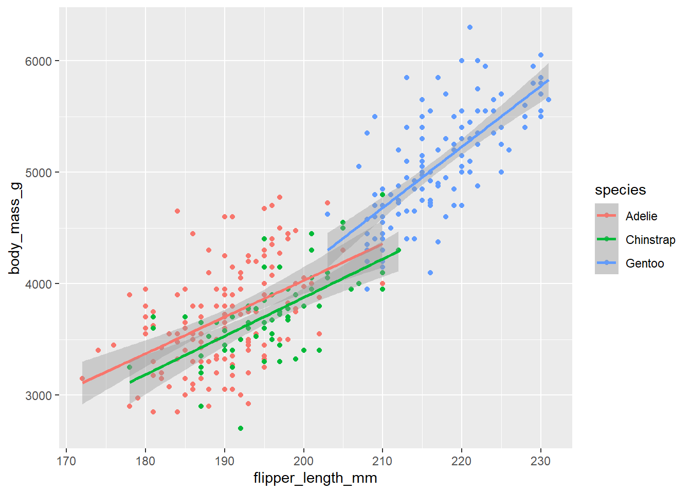
ggplot(data = penguins,
       mapping = aes(x = flipper_length_mm, y = body_mass_g)
       ) +
        geom_point(mapping = aes(color = species)) +
        geom_smooth(method = "lm")
`geom_smooth()` using formula = 'y ~ x'Warning: Removed 2 rows containing non-finite outside the scale range
(`stat_smooth()`).Warning: Removed 2 rows containing missing values or values outside the scale range
(`geom_point()`).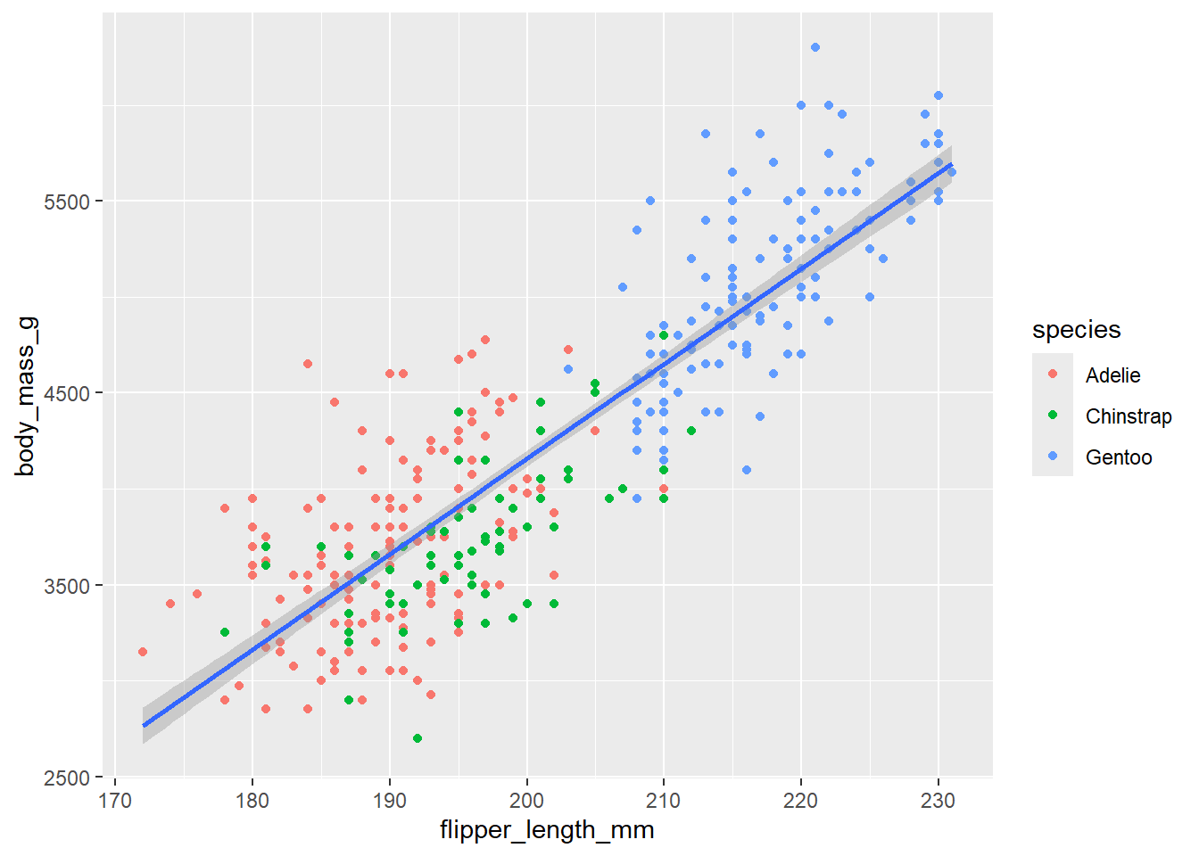
Produce a graph using ggplot that plots flipper_length on the x axis and bill_depth on the y axis, with color differentiating their sex. Produce this plot again, this time with color differentiated by species, does this give you a different view of the data?